Content
10 things you need to know about graphic design
- Semiotics
- Anatomy of Type
- Key Fonts
- Typeface/Font
- A good rule when working with type is to use a maximum of three fonts.
- Colour Modes
- Colour Wheel
- Colour Harmonies
- Complimentary Colours
- Pantone Colour Matching System
Research
Layouts and Spreads
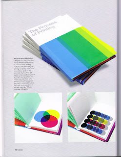
This publication caught my eye because of the clean minimal visuals used. I think I want to design my spreads in this style to clearly and simply communicate.
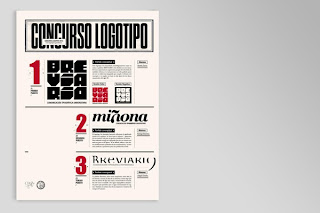
I like the use of hierarchy of type by highlighting one word with the colour red. This is a technique I could experiment with when designing my layouts.
These layouts make good use of utilising the DPS by having sections bleed onto both pages. This helps to guide the eye smoothly across the page.
This publication is my favourite out the lot. The modernist aesthetic really excites me because of the simplicity, limited use of colours and functionality of grid systems and layout. Something like this is what I am wanting to achieve with my own personal touch.
I like the pagination systems used in these two images. The colour co-ordinated tabs work well and catch the eye, making the viewer want to further explore the book.
The image below had a simple cut out section with the page numbers clearly displayed with a large point size with a bold font.
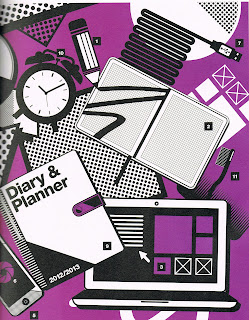
This is the kind of simple vector illustrations I am wanting the design to work along side type.
Images above sourced from 'What is publication design' by Lakshmi Bhaskaran
Network Magazine
The images on the left hand page direct the eye to the starting paragraph.
I like how the columns go from left to right in a step sequence, this guides the eye to the top of the right hand page making you want to turn the page and read on.
No.Zine
link
link
I like the stock used in this publication. This has made me think I would like to print onto an off white stock.
link
link
link
link
link


No comments:
Post a Comment