Showing posts with label Studio Brief 3. Show all posts

Monday, 6 January 2014

OUGD504- Restaurant Name Research


I was trying to think of names for my restaurant that related to type in some way. Whilst researching Japanese gods I came across one that was the God of language, learning and calligraphy that was supposed to of taught humans to write. 

I thought the Name Tenjin Yakitori bar would be the best fitting name for the brief as it has a link to typography and yakitori is the style of food being served. I decided to label it as a bar because the food is for sharing for a sociable event so I felt a bar would be the best settings for this kind of outing.


Speaking of what they look like, what makes a Japanese dragon a Japanese dragon? When most westerners picture a dragon, they’ll think of the above mentioned European style dragons with their big wings and fire breath. Japanese dragons are quite different. Japanese dragons, and Asian dragons in general, are much more serpentine than their European counterparts. Japanese dragons also only have three claws on each foot, and don’t fly as often as they lack wings.


Japanese dragons have three claws so I though I could incorporate this into my design to add to the concept. I want to include a dragon in my design but the conventional style of illustration.

OUGD504- Paper Folding Techniques Research

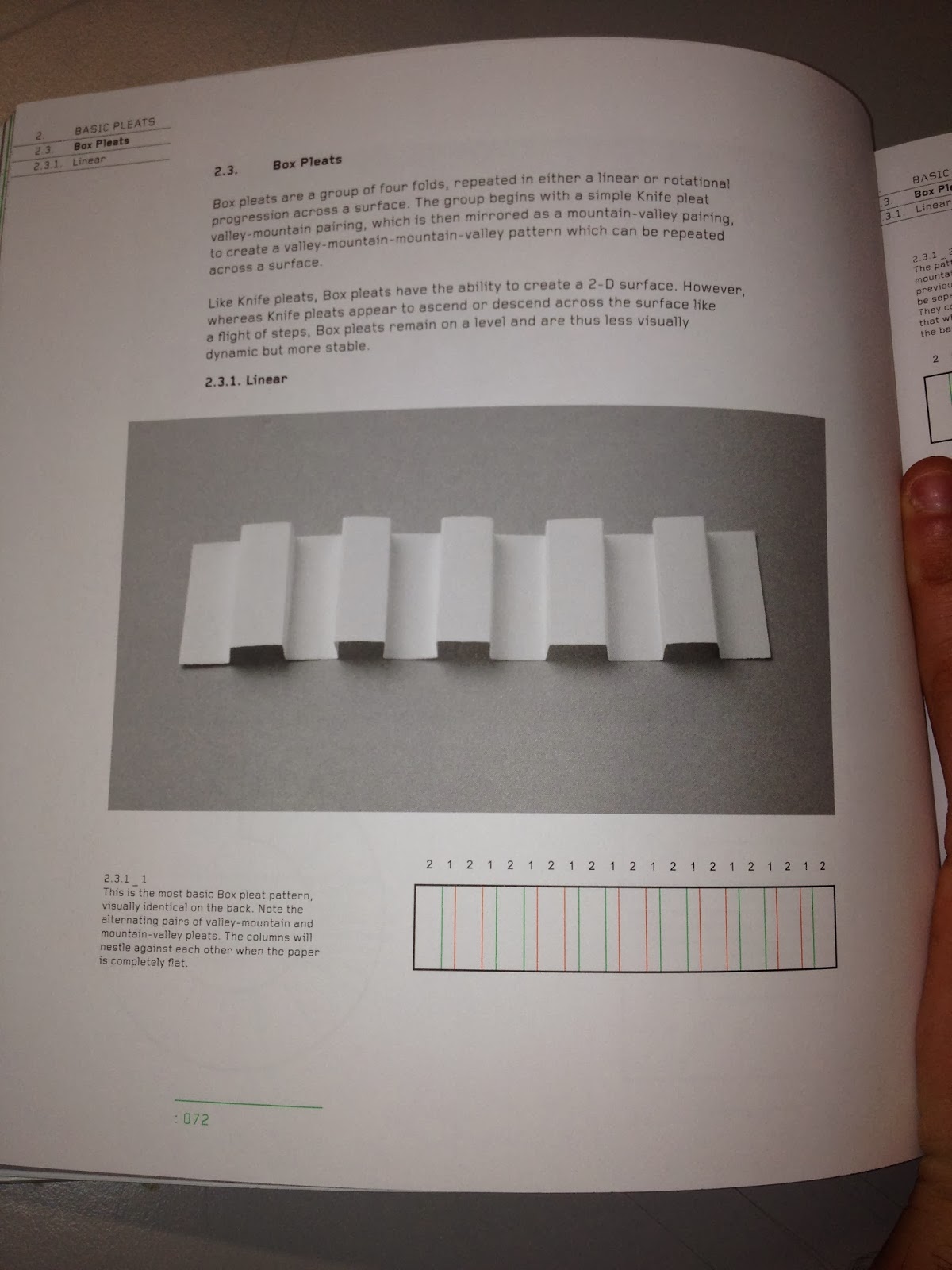
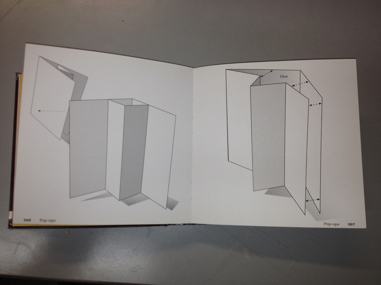
For the print side of the brief I am going to create a range of material so I wanted to have a look at different folding techniques to get some ideas.

Chopstick packaging was one of the things I wanted to include so I have found a simple design that I can use for a template.


This gave me the idea to create chopstick holders as I found its a common thing within Japanese restaurants. The designs below a simple but effect in communication a contemporary take on the idea.


Menu Design Ideas

The next thing I want to create is a menu so I have looked into different ways of achieving this in a bit more of an interesting way to the conventional flat menu. This will also suit the theme of the restaurant.


This design allows for the content to be displayed in different ways, the menu is broken down into four sections so this could be an option.


This design caught my eye because its interactive. When it opens it reveals the middle circle, this would look really impressive with the logo in the center.


I like the idea of using this for the menu because it represents the bars on the cooking grill which is the main idea behind the menu and style of restaurant. This could be for the sit down menu as it can become part of the table feature.


This design would work well with the style of food as it could be self standing on the tables.


I like how the design above and below are in three sections, the first could display the logo and restaurant name, the second could be the drinks etc and the third the main menu.


The design below is pretty simple but the fold at the top could be modified to create a nice decorative effect.


I really like these two design because the folds relate to the type of restaurant by representing the grill that the food is cooked on.


OUGD504- Traditional Japanese Print Research

The images are sourced from the book Japanese Popular prints. I wanted to have a look at the kind of colours that are traditionally used in Japanese print. This will give me some ideas when I come to choosing my colour scheme.


I want to keep it simple but with impact so the colours will be limited like above, maybe no more than three to keep consistency across media. 


Red and black feature a lot in Japanese prints so I am going to use these colours in my designs.


A Japanese dragon definitely has three claws on each foot (Chinese dragon has five, Korean has four).

Ascending dragons are associated with success in life in Japan so I think it would be good to incorporate this somehow, also the three claws could be represented in my design.

Monday, 23 December 2013

OUGD504- Web Application Research

For the web side of the brief I have been looking at existing online menus. I am going to create an online menu that will work across iPad and smartphones platforms.  

Existing Japanese Restaurant Websites

I want to see what information is common on restaurant websites so I can identify what is necessary for mine and how to best use navigation for better usability.


This website has drop down down menu to the left, I could use drop downs to break the menu into easy accessible sections.


I don't think this website is very good, it looks cluttered and confusing. I want to keep my design minimal and easy to use.


This site uses similar colours to mine and uses images. I hadn't though about images but I could include some on the homepage or menu pages.


I think this design uses the space well, its clear, precise with information and easy to use.


A three column grid could be a good way to display the menu on an iPad.


The website above looks sleek and contemporary, I think something similar to this we be appropriate and work with the printed material.


From what I have seen I have noticed common things:

Navigation:
-Top bar
-Drop down menus


Pages/Content to include could be:

-Homepage
-Menu
-Opening hours
-Map
-Contact Details


Existing Responsive Websites

I want to display my website across platforms so I wanted to have a look at how some websites achieved this. 


Using buttons like this design could be a way of me displaying the links for the menu page of my site.


This design has the links at the top of the page like the desktop design. I could have the two page links at the top of the screen.


I noticed that a lot of sites use the menu icon at the top, this swipes the screen to the left to reveal a hidden page. I like how this works but I'm not sure if would be appropriate for my site.


Dimensions

I wasn't sure what the screen sizes were for the iPad and phone.


:1024x768px


:320x480px

OUGD504- Japanese Restaurant Branding Research

I started to look at existing Japanese restaurant brands to see what is already out there and to get a better idea of the range of printed material I can produce.


Menu and chopstick packaging are something I could design.


I like the use of the bamboo table mat, this could double up as a sushi rolling mat.


This example has a good range such as plates, uniforms and logo. 


I the binding of this menu, it has traditional character balanced with a contemporary design.


I think the use of wood communicates quality and a touch of class.


This could be adapted into take away packing to add to the print range.


I like the illustrative feel to this menu. I think it would help to visualise the food to people who may not be familiar to the cuisine.


These logos use negative space which is something Im interested in using if its appropriate.


This design has been applied to a pop up van which could be something to think about.


I like the foiling finish in these designs. Also, beer mats are another option for the printed material.


I like the reference in this logo to the fish and the technical side of the preparation of the food associated with Japanese food.


This design incorporates manga style illustrations which could be a fun way to brand the restaurant. However Im not sure I have the ability to create such high quality illustrations as drawing isn't my strong point.


This design using a variety of vibrant exciting colours that draw attention. Colour is something I will need to experiment with depending on the style of restaurant I decide to design.


Loyalty card are a another option for the print materials but this also depends on the style of restaurant as I associate them with less up market establishments, more of a food chain.


Doggy bag/leftover bag is another print material I could apply the branding to.


I like the use of red and black but it seems to be a recurring thing in the designs I have looked at so it making me thing I should stay away from it.


Interior/Exterior

I started to have a look at how a design can be applied to the interior and exterior to get some ideas to propose.


I can mock up the exterior sign with the logo/name.


Designs could be applied to light fittings.


I like the idea of the dinners being in the center to create a gathering and a real sociable atmosphere.


I like the idea of proposing the design onto drops which could be on the interior and exterior.


These colours are contemporary and fun, this would suit the target audience.


I like the clean minimal look however I don't think it should be to clean cut incase it looses personality.


I like the minimal style illustration in this design, this could add some character to a simple design.


This is a good idea to propose, it creates an identity for the restaurant using a range a different media.


The colour scheme in these designs consists of two contrasting colours, I will need to choose a simple scheme for my design for maximum impact.


A window display is something I could propose with my design.


I would like my restaurant to have a section where people can go up and choose their food that would be cooked in front of them and also have a sit down area if people want table table service.


Something similar to this could be nice for the table setting or table mat.


This is a traditional Japanese type of binding that could be a possibility for the menu.


I like the square business card, I might use this format for my design.


A minimal illustration using block colours like this design is similar to what I have in mind.