I wanted to have a look at some Japanese design to get some ideas of how I could brand the restaurant.


I like the traditional look to this design. I could create something similar using a stamp to apply the branding to different material.

I think the black and red work well together to create a contemporary design. I think my design will work best with a limited colour palette. The red can also relate to the Japanese flag.

I like how the type is vertically arranged. This could work well when thinking of application to banners and restaurant interior.


I could use the Japanese letterforms to mimic English letterforms.

I like how the counters are filled in this type.


This logo uses type as image which was my initial thought to incorporate the typographical element to the restaurant.

I like the worn effect in this logo, it communicates authenticity.

This style relates more to calligraphy and the handmade.

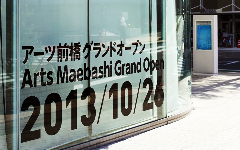
I like how this image uses English letterforms with Japanese characteristics.

This design is more clinical which I like. I has a young, trendy contemporary feel which fits the target audience I am wanting to attract.


This design caught my eye because of the colours. The blue works well with the black.

Here I like the use of negative space, I think i will need to use this technique in my design if I use type as image.


I like the illustrative style of these designs. I think the bold lines stand out and add impact.


Again, the hand made, scratchy style seems to be a recurring theme with Japanese design. I like how it looks so this could be the way to go when thinking of printing etc...


This design stood out because of the block style font. Its really bold and eye catching. It reminds me off food an a stick as well.


I came across these design which made me think about print application and things I could propose.

No comments:
Post a Comment