Products
Below are the products that the posters will need to communicate:
-Body Butter
IF THE CHANGING SEASONS LEAVE YOUR SKIN DRY OR UNCOMFORTABLE, LOOK NO FURTHER THAN THE BODY SHOP’S ICONIC RANGE OF BODY BUTTERS. OUR RANGE OF DELICIOUSLY SCENTED BODY BUTTERS WILL HELP KEEP YOUR SKIN FEELING SOFT, SMOOTH AND HYDRATED FOR UP TO 24 HOURS. WHAT’S MORE, THEY’RE MADE WITH COMMUNITY FAIR TRADE SHEA BUTTER BECAUSE WE BELIEVE IN BEAUTY WITH HEART.
-Colour Crush
PRODUCT DESCRIPTION
This luscious lipstick gives a stunning pop of colour and rich moisture, infused with a subtle rose scent.
- High-impact colour
- Rich moisture
- Infused with a subtle rose scent
-White Musk
PRODUCT DESCRIPTION
Our iconic White Musk(®) fragrance in a lasting eau de parfum. This sensual scent unites a heady mix of notes including musk, lily, iris, rose and vanilla.
- Lasting eau de parfum
- Contains cruelty-free synthetic musk
-Drops of Youth
PRODUCT DESCRIPTION
Our certified organic range has been created for the first signs of ageing. This innovative concentrate helps to enhance surface skin condition, leaving it looking smoother, fresher and healthier.
- Helps enhance surface skin condition
- Smoothes
- Instantly moisturising
- 99% of ingredients are of natural origin
Primary Research
Me and Roxxie went to the body shop to have a look at the current window displays as the posters will be designed to be displayed in the window. We tried to get some images of the points of sale inside but we were told we had to have permission from the head office to do so. Bit of a joke considering we are giving them our ideas for free!!!
The main positives we took from the research was talking to one of the staff about the target audience for each product and the colours they use. This will inform are decisions when choosing colour schemes etc...
Previous campaigns
One of the posters will need to communicate an idea for a campaign.
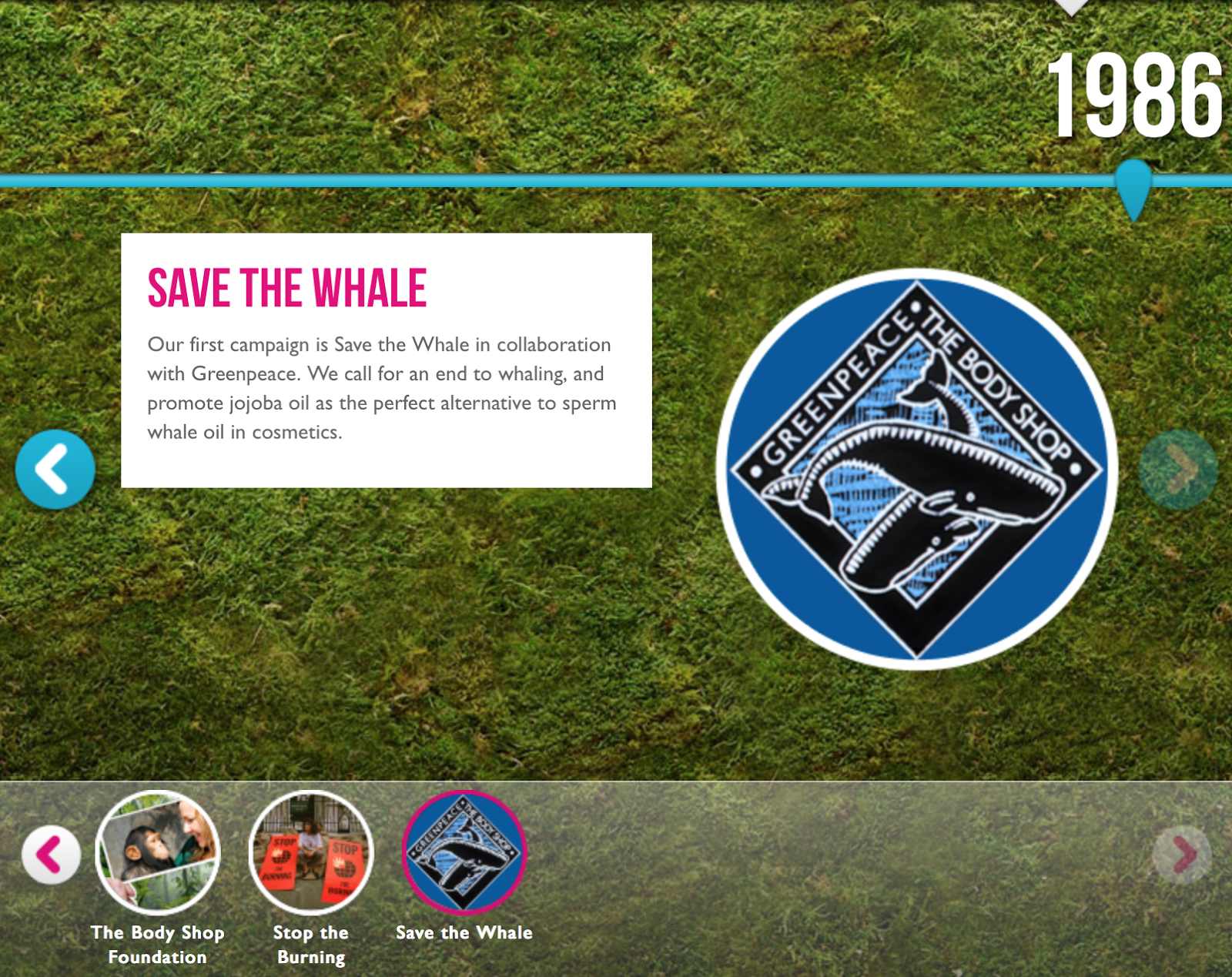
The images below are the campaigns the Body Shop have done so far.
I couldn't find poster for all the campaigns but the ones that I did are really simple with high impact. This will be something we will need to consider when designer the poster. I think the colours should be limited and the type or imagery simple to achieve maximum impact to draw attention.
Following on from our first meeting, me and Roxxie brainstormed some ideas for the campaign poster and we thought the most current and relevant topic at the moment is same-sex relations. This has become a talking point recently surrounding the problems in Russia. We thought this would be the most appropriate topic for a campaign and something that the body shop would consider promoting.
On Tuesday, the Kansas House of Representatives overwhelmingly approved a measure designed to bring anti-gay segregation—under the guise of “religious liberty”—to the already deep-red state. The bill, written out of fear that the state may soon face an Oklahoma-style gay marriage ruling, will now easily pass the Republican Senate and be signed into law by the Republican governor. The result will mark Kansas as the first state, though certainly not the last, to legalize segregation of gay and straight people in virtually every arena of life.
I came across this article about Anti-Gay segregation. It really seems to be a big problem at the moment which reinforces the idea to use it for the campaign poster.
http://www.slate.com/blogs/outward/2014/02/13/kansas_anti_gay_segregation_bill_is_an_abomination.html?wpsrc
LGBT is an initialism that stands for lesbian, gay, bisexual, and transgender. In use since the 1990s, the term is an adaptation of the initialism LGB, which itself started replacing the term gay when in reference to the LGBT community beginning in the mid-to-late 1980s, as many felt the term gay community did not accurately represent all those to whom it referred. The initialism has become mainstream as a self-designation and has been adopted by the majority of sexuality and gender identity-based community centers and media in the United States and some other English-speaking countries.[3][4] It is also used in some other countries in whose languages the initialism is meaningful, such as France.
The initialism LGBT is intended to emphasize a diversity of sexuality and gender identity-based cultures and is sometimes used to refer to anyone who is non-heterosexual or non-cisgender instead of exclusively to people who are lesbian, gay, bisexual, or transgender. To recognize this inclusion, a popular variant adds the letter Q for those who identify as queer and/or are questioning their sexual identity as LGBTQ, recorded since 1996.[6]
On the one hand, some intersex people who want to be included in LGBT groups suggest an extended initialism LGBTI (recorded since 1999). This initialism "LGBTI" is used in all parts of "The Activist's Guide" of the Yogyakarta Principles in Action. Furthermore, the initialism LGBTIH has seen use in India to encompass the hijra third gender identity and the related subculture. More recently the catch-all term "Gender and Sexual Diversity" GSD has been proposed.
For the campaign poster we are thinking of using the colours from the LGBT flag to represent the gay pride messages.
Modifications of the classical gender symbol (based on astrological symbols, Mars for male and Venus for female) have appeared to express various LBGT "gender identities" since the 1990s. Two interlocking male symbols form a gay male symbol. Two interlocking female symbols form a lesbian symbol. Variations on this theme can be used to represent bisexuals, transgender persons, as well as heterosexuals.
Quilling
In our meeting we also discussed ideas of aesthetics and how we would design the poster. One idea and technique we both thought would be appropriate is quilling. We thought about keeping the poster more typographic for impact in a quilling style. I am going to research into quilling to see how we could use different techniques to create a well though out deign.
I had a quick look online for quilling paper and there is a massive variety of colours which is really good for us as we can match the colours with the products.
Although we are thinking of focusing on type I wanted to have a look at the different techniques that we could possibly use as decoration.
Examples
This image uses 3D shapes combined with quelling, we discussed combining both techniques so we could design something like this.
We could create something similar to above and use the quilling as the background to enhance the product and have an actual image of the product.
I found this design with the workings behind how it was created. It was interesting to see how it was made and I think drawing it out will be the best method depending on what we design.
The colours in the image above would work really well for the lipstick product. The shape of the design also reminds me of lips, we could use subtle techniques like this to target the subconscious.
The three images above use type with the decoration inside the letterforms and the one below surrounds it. This is something we will need to consider wether to have the inside of the letterforms empty or filled, I imagine this will depend on the surroundings and overall design.
Social Media


No comments:
Post a Comment