Skeuomorphism and Flat Design within Contemporary Design Movements.

My essay was about Skeuomorphism and Flat design. I chose to write about this subject because it was interesting exploring the arguments for both parties with the conclusion that there is no right or wrong answer as to which philosophy is best. I discovered that both have pros and cons that can be intertwined to get the best out of a design depending on the purpose. This is something I want to communicate in my response to the brief by making the user aware of the pros and cons of both and the possibilities of using both tastefully to get the most out of a design.

Wikipedia defines “skeuomorphic” as: “a derivative object which retains ornamental design cues”. This is translated into the design world as user interfaces that look how they do in real life. Design elements that have shadows, gradients, reliefs, usability, and details that resemble how that object would look and act in the real world.
Pros:
-Skeuomorphic design orients people immediately. It allows for a more intuitive use which in a way opens up the floodgates for a larger demographic.
-This design style has more depth, visually. I saw a site refer to skeuomorphic design as lending more “treats” for a user’s eye. Which can play into the next pro…
-Skeuomorphic design may lend to a richer user experience. With more “do-dads” in play, there’s a chance that your visitors with more time and less attention span will stick around.
-It’s a designer’s dream. We love textures and attention to detail and that’s exactly what skeuomorphic design is all about.
Cons:
-Skeuomorphic design is in the “more is more” state of mind which can hurt the audience that has a specific reason for visiting your site. When someone is looking for your contact information they could care less about your perfectly constructed gradient over stitched-leather texture.
-It can show a bit of lack in creativity and ingenuity. It takes a heightened sense of observation to not only pick up on the nuances of everyday objects but to be able to recreate them in a digital world, but to the user that isn’t a graphic designer, they’ll just think you’re lazy. Plus, think about how knobs work; they work because you can grab it with your hand and have control over speed and tension. A knob on a website that can only be used with the mouse is pretty useless. A good idea on the table isn’t always a good idea on the screen.
-These designs take more time and look dated faster. Plain and simple.
-Not really “responsive web” friendly.
Skeuomorphic Design 101

Skeuomorphic design is often a very challenging design style. It's not easy to replicate a real life object in a two dimensional design. Besides, often realism is embedded in the skeuomorphic design to make it work even better. One of the problems designers face is that these designs must "feel good". It's easy for users to spot a mistake in a design when you decide to create something realistic. There's a lot of work in designing perfect textures, shadows, depth, and colors for an interface or icon. However, skeuomorphic design is especially helpful when creating digital products for an older target audience who might be unfamiliar with the digital world. It gives the user the feeling they recognize the product they're using. A good remark though is that nearly everyone now has started to recognize "the digital language" and we often have the same digital behavior patterns in interfaces.
Why Skeuomorphism Remains Relevant
Skeuomorphism’s rise has been directly tied to the design of Apple’s iPhone and iPad, which pioneered the use of skeuomorphic buttons and icons. Steve Jobs was a huge fan of this type of design, but after his passing in late 2011, his company began to experiment with new approaches. The enthusiastic reception for Microsoft’s Windows 8, which uses a flat design, put even more pressure on Apple to consider evolving to a flat design approach, and it finally implemented some of those ideas in its latest operating system released in mid-2013.
Still, that was hardly the death knell for skeuomorphism. What it really means is that it will be employed more selectively, in places where it really makes sense, rather than as the default design for everything. The simple fact is, realistic design still has a valuable place in the digital world.
One of the great values of skeuomorphism is that it gives the users clues on how to operate something. When touchscreens were in their earliest days, people didn’t understand what swiping was. With the assistance of visual cues from skeuomorphic design, they figured out how to swipe pages in a book or open a magazine sitting on a virtual newsstand. And those are things that remain useful even with the maturation of the touchscreen.
Especially for older people, realistic design still acts as a sort of guidepost in the digital world. Those who are less familiar with technology will probably always understand realism in design more quickly than minimalism. It can also work well in cases where a visual representation helps the user understand what he or she just did. For instance, in an earlier version of Passbook, tickets or vouchers could be “shredded” once they’ve been used, sending a clear message about the status of the electronic document.
What is Flat Design?

Flat design uses simple elements and shapes combined with predominantly bright colors to emphasize simplicity and clarity.
-This type of design is conducive to responsive web design.
-It’s straight forward and honest. Flat design has been referred to as “two-dimension design for a two-dimensional screen”. It allows the user to feel like they can really see everything that’s going on.
Cons:
-At the end of the day, lots of sites will start to look similar.
-Although it is an art to be able to hold back as a designer, there isn’t too much deep design going on. Design planning, yes (planning different layouts for different devices, etc), but not as many creative button designs and such.
-Sometimes things are so simple that it confuses people. Flat design calls for the designer to be able to strike the right balance between smart and convoluted.
-Believe it or not, it’s more difficult. Lots of shaky interactivity and usability is overlooked thanks to beautiful and well designed skeuomorphic designs. Flat design calls for so much more engineer-like creativity. You can make buttons look pretty all day, but if they don’t work then what’s the point?
Exactly that: things have been been flattened. Flat Design has its roots in 1950s Switzerland. The ‘Swiss style’ design philosophy emphasizing minimizing, cleanliness and content organisation. Its fundamentals consisting of a grid system for aligning content and San-Serif fonts (ie. Helvetica – Latin for ‘Switzerland’).
What we see now with Flat Design are these principles being applied in the Digital world. The removal of the ‘bells and whistles’, leaving us only what is important: Colour, Shape and Content. A presentation method which is effective at being both minimalist and beautiful. And with the rise of mobile computing, minimalism is a key advantage. Reducing the stress on low power systems.
Flat Design 101

Flat design tries to emphasize usability and simplicity. Often it's a minimalistic approach accompanied by the use of bright colors. Whenever you hear other designers speaking of flat design, usually the word "user experience" is often brought into the conversations. In general, people believe that flat design offers both greater usability and greater user experience than skeuomorphic designs.
Typography

Because typography begins to have a founding role in the visual hierarchy of a page – or, at least, more so than in traditional designs – choosing and using the right font is a big decision. In a lot of flat designs, you'll generally find sans-serif primarily at play due to serifs themselves being unnecessary embellishments and a sign of formality rather than modernism. Of these sans-serif typefaces, you'll be looking for ones with availability in a variety of weights so that only one or two families are needed to populate your design's entire hierarchy, in order to keep up the minimalist, simple feel.
Microsoft

Since Microsoft has long been an early proponent of flat, authentic design, its principles are probably the most developed and established.
Microsoft defines Metro as four core principles: typography, motion, content not chrome and honesty.
-The establishment of a visual hierarchy through the characteristics of typography, using it to form the basis of a layout and its navigation without the use of superfluous graphical features
-That motion and the fluidity and performance of a design is equally as important to the aesthetics of a design
-Putting content, not chrome, upfront to both put more focus on the actual body of content and allow designs to be scaled appropriately
-Being "authentically digital" and holding honesty to the very fact that consumption of the design is digital, leaving the design of offline objects, offline
Flat UI Design vs Skeuomorphic (Traditional) UI Design
I found this video by Mike Locke that I thought had some good examples and analogies.
I’m a huge fan of the minimalist approach and so I like the flat look but agree that it has it’s downfalls. I think it will transform a bit much like skeumorphism went from drastic realism to a streamlined digital interface.
There are ways to keep things pretty flat in design and continue to direct the users attention through the content which is key for any design. That’s the difference between flat and metro to me. Metro was incorporated by Microsoft and is a classic look like you mentioned. Flats is more desaturated, soft and still minimal. It has it’s uses when done right. Done right is the issue!!
I came across this website that illustrates the story behind both design movements in a creative and simple way. I think its a really clever idea using characters to represent skeuo and flat design however the website is slow and not very functional which in my opinion plays into the hands of the argument for flat design. However, I like the concept and it has inspired me create something similar in my own style.
"We created a story which metaphorically narrated what we felt was taking place in the world of digital design"


Skeuominimalism
Skeuominimalistic design is simplified up to the point where simplification does not affect usability. And its skeuomorphic affordances are maximised up to the point where it does not affect the simple beauty of minimalism.
Flat UI Design vs Skeuomorphic (Traditional) UI Design
I found this video by Mike Locke that I thought had some good examples and analogies.
I’m a huge fan of the minimalist approach and so I like the flat look but agree that it has it’s downfalls. I think it will transform a bit much like skeumorphism went from drastic realism to a streamlined digital interface.
There are ways to keep things pretty flat in design and continue to direct the users attention through the content which is key for any design. That’s the difference between flat and metro to me. Metro was incorporated by Microsoft and is a classic look like you mentioned. Flats is more desaturated, soft and still minimal. It has it’s uses when done right. Done right is the issue!!
I came across this website that illustrates the story behind both design movements in a creative and simple way. I think its a really clever idea using characters to represent skeuo and flat design however the website is slow and not very functional which in my opinion plays into the hands of the argument for flat design. However, I like the concept and it has inspired me create something similar in my own style.
"We created a story which metaphorically narrated what we felt was taking place in the world of digital design"
Skeuominimalism
Skeuominimalistic design is simplified up to the point where simplification does not affect usability. And its skeuomorphic affordances are maximised up to the point where it does not affect the simple beauty of minimalism.
Make it minimal, but do not make away with shadows, lighting, volume, depth, focus and textures when they are necessary for affordances.
it's essentially flat design with elements of skeuomorphic design. The focus on skeuominimalistic interfaces are on colors, shapes, and to an extent, typography. Shapes and colors are used to add dimension. The use of subtle drop-shadows are okay since it can create a level of dimension in design that's not over-the-top or tacky.

The new iTunes is a great example of skeuominimalism. By using physical familiarity of shadows, gradients and highlights the buttons afford to be pressed. The soft noise and gradients gives it a bit of mood lighting. It looks beautiful!

Jasmine, a YouTube client for iOS, perhaps goes a bit too far on the minimalistic side (by sometimes losing affordance in favor of simplicity) but it still uses shadows (for depth/hierarchy) and soft gradients for mood lighting.
The new iTunes is a great example of skeuominimalism. By using physical familiarity of shadows, gradients and highlights the buttons afford to be pressed. The soft noise and gradients gives it a bit of mood lighting. It looks beautiful!
Jasmine, a YouTube client for iOS, perhaps goes a bit too far on the minimalistic side (by sometimes losing affordance in favor of simplicity) but it still uses shadows (for depth/hierarchy) and soft gradients for mood lighting.

Almost Flat Design doesn’t ignore the concept of depth. Instead, depth is used to support comprehension of the interface. But, just like gradients, this can be done in a subtle way and still allow for separation of information along the z-axis.

Google’s ‘skeuominimalism, a mix of classic skeuomorphic design and flat design. Simple, descriptive icons.
As the internet flattened, Google joined in on the fun. Their take, apply named Skeuominimalism adds the minimilistic nature of flat design to the intuitive, understandable nature of Skeuomorph. This results in flat, minimalist icons which use real world pictures and object to convey plenty enough information for us to understand.

Gradients in Almost Flat Design
For the most part, these interfaces stick to the flat design principles of flat colors, no drop shadows, and use of color to encourage specific user actions (e.g. red compose button in Gmail). But if you look closely, that compose button does have a slight gradient. It’s a gradient that says, “Hey, I’m a button you can press,” and not “Woah! I look like I’m made from candy! Oh and you can press me too.” Subtle affordance is a big component of Almost Flat Design and gives it a critical advantage over true flat design.
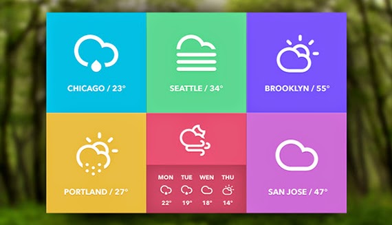
Flat Design Visual Research


Skeuomorphic Visual Research


Google Style Guidelines
I found this project on Behance of Googles visual asset guidelines. I think Google has a good balance between flat and skeuo design so this is something I can take into consideration when designing my resolution.
This has given me the idea to create my own mock guidelines to represent my take on flat and skeuo design and how to use them.

Style Guideline Aesthetics


I like the simple stripped back aesthetic of the designs above, this is something I am wanting to achieve to represent the minimal, stripped back approach and efficiency.

This example shows the old and new iOS software. I would argue the one on the right is more functional in regards to content, the translucent background communicates honesty by suggesting the digital space behind is where the main content is, creating a more truthful experience in regards to a digital space.

Another thing I noticed was the content fully utilises the screen space for an uncluttered, structured layout. Its clear to see a strict grid system has been used.

Typography Research
Sans-serif fonts are used within flat design so I wanted to have to have a look at some of the most popular fonts being used at the moment that I will consider using in my deigns.

This font would be a good choice because it has a large variety of weights that can be used for hierarchy.


Website Research
Because I am thinking of proposing a website with the guidelines on, I wanted to have a look at different websites to see how what things I can take from each that are recurring and that I think are successful used.


The images above use illustrations that are flat and forward facing, this is something to include in the guide.

In these two examples, the buttons or points of action are flat but use outlines to disguise there purpose, to be pressed. I think this method is one way of disregarding gradients and bevels whilst still retaining the function. Colour is also used for extra clarity.


These example use different weights within the same font family. This is a good example of how type can be used for hierarchy.


These icons are flat but still use drop shadows. I think this is applicable but the shadows should be kept hard instead of having feathered edges to represent real life shadows. This is something else to include ion the guide.

This button uses similar techniques to the google style 'skeuominimalism' It still has depth but by using flat colure and shapes. I think this button isn't the best and could be more subtle but the principle is the same.
Practical Applications
Practical Applications


I started to think about different applications for each design style to include in my guidelines. I think skeuomorphic designs work well in certain contexts such as food/restaurant sites because the real words images are visually appealing and communicate the purpose of the site.
A few others I thought was applicable are music software to make it understandable by forming a relationship to the physical, Fashion websites because of the textures of fabrics and hand made elements and lifestyle websites as it connects on a personal level.


All the Flat design websites I have looked at have continuos scrolling pages. I am thinking of having two links on my site so this might be the best way to display the content with navigation at the side.


The examples above are how I imagine the guideline section of my site to resemble. I want it to be clean and easy to understand whilst utilising the style of design the content will be talking about.
Infographics Research
I want each of my web pages to resemble the layout and style of info graphics. I think this will be a good way of explaining the ideas and help to create a structured layout.


These examples use flat and skeuomorphic designs. For the about section of my site I want to split the layout into two half's to show to show the comparison of the two.


No comments:
Post a Comment