My essay was about Skeuomorphism and Flat design. I chose to write about this subject because it was interesting exploring the arguments for both parties with the conclusion that there is no right or wrong answer as to which philosophy is best. I discovered that both have pros and cons that can be intertwined to get the best out of a design depending on the purpose. This is something I want to communicate in my response to the brief by making the user aware of the pros and cons of both and the possibilities of using both tastefully to get the most out of a design.

I started off by listing the pros and cons of each and mind maps for each topic and the brief overall. As the topic is about digital design I am am going to propose a website that is intended to inform and educate.I want to create an info graphic themed page and a secondary page that outlines the characteristics that are successful in my opinion. The first page will be to do with the background to give some context and the second age will be my interpretation of what I have learnt. I want to include both as there is no right or wrong answer and it mostly subjective.
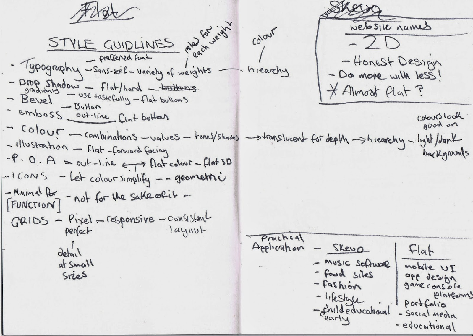
Whilst researching and analysing common threads i have made a list of elements that I think are relevant. I also starting thinking about how this could be applied in a practical context, such as music software being better suited to skeuomorphic design because it helps understanding of how the software works.

I made a rough plan for how the website, I am going to have a homage with two links, about and guidelines. I will also have a logo to link back to the homepage just to cover all areas of navigation. At the bottom of each page there will be a back to top button for better usability.
I sketched a few ideas down for the guidelines page. I think I am going to have a set of visual guides that show different methods of working that I think are successful.

The dimensions of the page are 1024 x 768px this is the standard screen size so should work across platforms.Im not sure weather to have the links horizontal or vertical yet so I will just have to experiment when working on screen.
Typeface:
Open Sans

Digital Development

I have made an illustration to represent the ting and yang symbol to represent both sides of the content (skeuomorphism/flat design) I have used a square instead of a circle to represent a pixel as its relevant to the theme.

I have changed the colours to work better. The red and orange will relate to the two links on the site.

As I am naming the website 'Almost Flat?' I have applied a drop shadow to the lower section of the logo. This refers to the characteristics of skueominimalism to link all the sections of the website whilst being ironic because all of the styles or relevant within the content.

I am going to have the links in the top right corner, if the site was live the links would be fixed in place when scrolling down so the user can navigate between pages.


I want to keep the layout relevant to the content so I will be using grids to align the elements for a structured design.

The about page will be in two sections so I have made some guides that divid the page equally.

For extra navigation I have used the illustration logo from the homepage as link back to the homepage. This covers all aspects of navigation for functionally and usability.


Something didn't feel right to me about the design so I tried a few colour changes however, I felt the page needed to be more open so I had a re-think and started again.

Also, I felt the link buttons looked tacky so I have stripped them back and kept them horizontal.

I wanted the use the colours from the homepage so each page looks consistent. I want the layout to be themed around info graphics so I have stripped back the page to the essential information. I think this is much more appropriate to the context.

I want to construct the symbols and illustrations using both techniques from flat and skeuo design so I have used flat vector lines as well as a drop shadow. I want to synthesis the theories I wrote about in my essay throughout the website to show my understanding of the subject.

I felt the homepage logo looked isolated on the left so I have moved it inline with the link buttons.

I know feel happy with the first section of the page. I think it looks much better and utilises the negative space for better digestion. I have used the line coming off the question mark to make it clear to the user that they need to scroll drown the page for more info.


On the second page I am going to have a short description of what each subject is. I want use illustrations to support what is being explained in the copy.

To illustrate skeuomorphism I have made the illustration 3d with the extrude and bevel filter.


To further communicate the two sides of the subject I am going to have the type left and right aligned.
Second Section

To finish the page off I have made a down arrow for usability, to make it stand out from the line I have used a subtle drop shadow on the arrow.


After finishing the second page I felt the colours of the homepage and buttons needed adjusting because they didn't work overall.
Third Section

For the third page section I have re-used the illustrations I discarded earlier. I think the problem was the negative space. The first page needed to be open and clear so this works now its into the third page. I am going to alternate the blue and orange arrows for the navigation.

The next section will have the pros for each category but with two conflicting visual styles to illustrate the characteristics of each.

The skeuomorphic side will be over the top and purposely made to look handmade. I tried using hand drawn fonts to illustrate this.


I used some sketch style illustrations to reference some of the statements, I felt the font needed to be a marker pen style to better suit the illustrations. I used a cog symbol the represent the workings behind each design style.


One of the points mentions how it relies heavily on illustration so I have used a combination of vectors and image for a visually rich style.


I thought about using symbols on the flat side to mimic the skeuo side but decided against it because i thought it contradicted the content so I used simple icons and rainbow colours to reflect this. It uses uses a grid and different weights of fonts to further support this.


I am pleased with the final layout, this will be a two part section and will lead onto the following page with the cons for each subject.


I have used illustration to convey meaning, the snapped pencil and pentagram bullet points communicate negative connotations.


I realised I had forgotten to change the symbols to the cross is stead of a check mark so I adjusted this to finish the section.


The next section will show some examples of how they can be used successfully when in the right context. I felt the last section was quite heavy with the colours so I have used a similar layout and colour scheme to the first section to give the eye a rest and make it easy to digest.

In my notes I made a list of possible purposes for the styles that I am going to show with images as examples. It will use the split layout to show the comparison.

I haves used the same shapes as the links buttons and the check marks from the pros section for continuity.


This is the final layout, I have kept the categories to five to relate to the five pros mentioned earlier.

To finish it I made the flat check mars the same colours as the pros section.


The next section will talk about the combination of the two referred to as 'skeuominimalism' or 'almost flat' The symbols represent the cross over of principles coming together to make one.


The illustration of the mac uses both ideas of skeuominimalism by having flat shapes with flat drop shadows to create depth.


I have stripped back the symbols to reflect the quote and style of design.

The button at the bottom of the page takes the screen back to the first section.
This is the first page finished now so I can move onto designing the the guidelines page.


I want the guidelines section to be very visual to make the content clear and easy to understand. I have made a range of different icons that I will experiment with in the layout. This was informed by the notes I made at the start, I have taken all the best points that I think are successful form my research.

I have used the three circles to represent the three styles talked about in the last section of the about page.


This section illustrates some of the characteristics and techniques that can be used to best suit the outcome. I want the user to take into consideration the output and chose techniques that are suitable.


Typography is a fundamental element of minimal design and a type face with different weights is preferred to utilise hierarchy.


This section illustrated the different effects that can used such as drop shadows, flat shapes and colour and shading effects. Again, the message is to use them subtly and in the right context.

Bright colours are a common thread in minimal design so I have included some of the most popular colour palettes for inspiration.

I wanted to include a section about geometric shapes and how they can be used to create icons for consistency to create well balanced designs.


This section talks about content taking priority so I experimented with the layout to utilise the negative. I want it to be open to avoid distraction of the illustration and type.


The next section is the final page so I have used the three circles from the first section to symbolise the end of the page. To finish the site off I have used a statement that I wrote to sum up my opinions surrounding the relevance of each subject and the considerations of the output.

To finish the page I added some symbols of digital devices to tie in with the overall theme.
Mock-up
I want to create a short animation to show how the website would work as I am not coding the site. I have arranged each detail onto separate layers so I can later edit them in Flash.

The background colour and the mac screen will be in the same position throughout so I have put them on two separate layers to allow the pages to sit underneath.


I have made separate layers for the links buttons. The colour of the text in the buttons will change colour to show how it would look if the cursor is hovered over.

Finally, I needed to make the links for the about and guidelines pages. I want them to be fixed with the content scrolling so they needed to be on a separate layer.
Adobe Flash Animation

I hadn't used flash before so it was a lot of trail and error to figure out how it worked. The principles are similar to photoshop and music software so I had a rough idea of how to use it.


The static images were easy to arrange, I had to load them onto separate layers and arrange the time frames accordingly. The hardest bit was the moving sections, I have to create motions tweens to allow the about and guidelines page to scroll.


I have made it so once the viewer reaches the bottom of the pages there is the option to go back to top button. I have made it so the animation show this by scrolling fast back to the top of the page before going to the next.


Once I had all the timing sorted out and in place I had to mask out the top and bottom where the scrolling pages were visible, I simply drew two boxes that were the same colour as the background.
For hand-in I have rendered the video to a quicktime file to it can be played on any mac, to upload to my blog I had to use Vimeo to embed the code. Considering I haven't used flash before I am pretty pleased with the outcome.
No comments:
Post a Comment