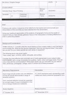
Alphabet Soup: Visual Thinking
For this brief we are required to produce a set,series or sequence of ten letterforms that communicate my interpretation of the word:
Subject Matter
Definition of layer
noun
verb
2propagate (a plant) as a layer:a layered shoot
Sourced from http://oxforddictionaries.com/definition/english/layer
Sourced from http://oxforddictionaries.com/definition/english/layer
Key Words
I have listed a few key words associated with the word 'Layer' to get my mind working.
- Sheet
- Quantity
- Thickness
- Material
- Several
- Covering
- Surface
- Body
- Arrange
- Overlapping
- Coating
- Film
- Veneer
- Skin
Visual Research
To start with, in are blog groups we were ask to categorise the letterforms we sourced over the summer into groups.
- Serif
- Sans Serif
- Uppercase
- Lowercase
- Objects in the form of letters
- Hand rendered
- Digital
- Italic
- Bold
- Calligraphy
This task helped me to understand and appreciate the vast anatomy of typographic forms.
Focused Research
Designed by Nick Job
http://www.typetoken.net/typeface/new-from-fontsmith-—-fs-elliot/
The lines working next to each other has given me an idea to cut letterforms into strips. Similar to the image bellow.
By Brendan Sparrow
http://www.brendansparrow.com/category/work/type/
Colloquy by Joel Baker
http://joelbaker.net
Typographic Music by Dina Silanteva
http://ddina.com/index.php?/2011/typographic-music/2/
Initially started off as research into generative systems and multi-layered typefaces. From the hand generated material I will create it could be interesting to combine them similar to the bottom layer of the image above.
Fontable by Alessandro & Andrea
Designed by Herman Chaneco
http://cargocollective.com/HermanChaneco/Night-Angel-Book-Cover-Series
By Niels Shoe Meulman
http://nielsshoemeulman.com
I like the idea of having inter-linking sections or even designing my letterforms to inter-link as a set.
Paper Typographic sculptures by Bianca Chang
http://www.biancachang.com
Detroit by Kelli Anderson
http://fontsinuse.com/uses/2187/crystalline-letters
Different shades of grey could create a nice illusion and trick the eye into thinking there are multiple layers within the letterforms.
By Adonit
http://pinterest.com/pin/155726099586336535/
By Richard Miranda
http://pinterest.com/pin/155726099586501298/
Good use of negative space. Creates depth and the illusion of layers. I like the idea of choosing a font set to experiment with, combining the different weights.
Patric Beland
http://pinterest.com/pin/155726099586472960/
This interests me again because of the use of negative space. Breaking down the letterforms into different sections might work well.
By Daniella Fritz
http://pinterest.com/pin/155726099586334605/
The relationship between textures and thicks, thins creates a nice layered effect here. The space in between the detail helps the eye to create depth on a 2D platform. Similar with the image below, the thins equally weighted displayed on a negative background creates the same illusion.
Tribbon layered font by Dominic Le-Hair
http://typeunion.net/2010/11/14/tribbon-layered-font/
Layered 3D Project
http://www.kornicki.com/antherm/Help/Content_EN/ProjectTypes/ProjectTypes.htm
This image has nothing to do with type but it gave me the idea to experiment with perspective. I feel I have collected enough research for now to allow to me start experimenting. The main points I want to explore are:
- Handmade
- Perspective
- Collage
- Combining weights
The font I have chosen to manipulate is helvetica Neue. I chose this font because it has different weight sizes which is something I was wanting to experiment with.


No comments:
Post a Comment