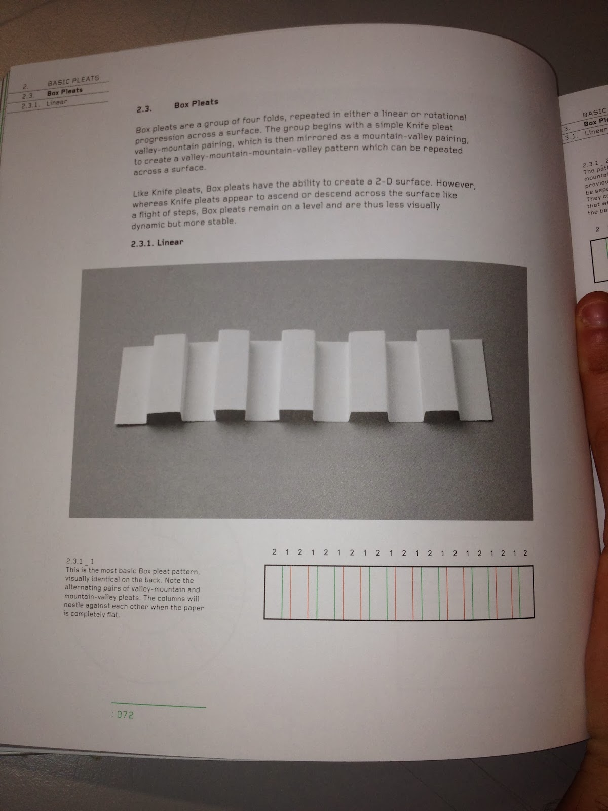
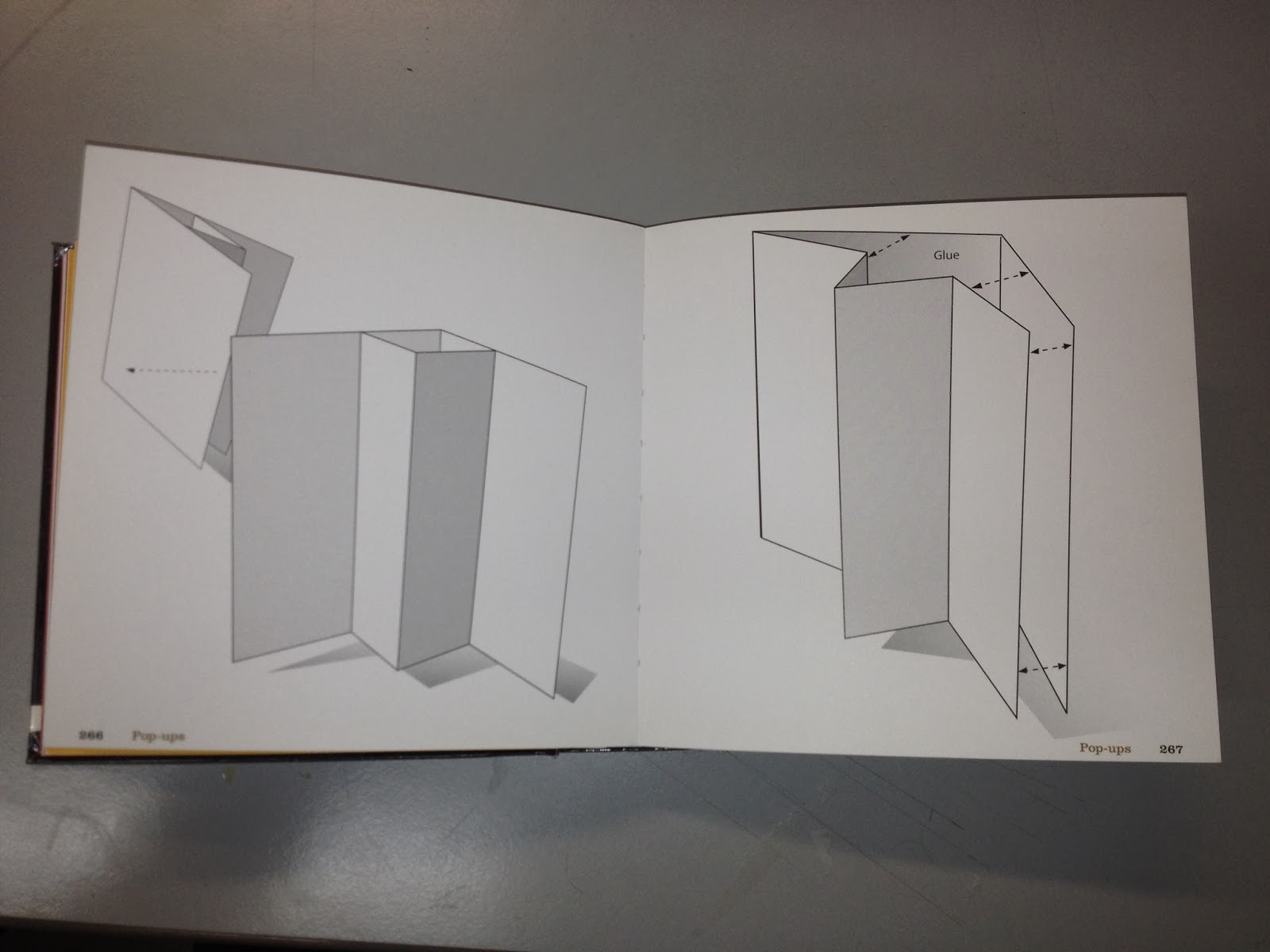
For the print side of the brief I am going to create a range of material so I wanted to have a look at different folding techniques to get some ideas.
Chopstick packaging was one of the things I wanted to include so I have found a simple design that I can use for a template.
This gave me the idea to create chopstick holders as I found its a common thing within Japanese restaurants. The designs below a simple but effect in communication a contemporary take on the idea.
Menu Design Ideas
The next thing I want to create is a menu so I have looked into different ways of achieving this in a bit more of an interesting way to the conventional flat menu. This will also suit the theme of the restaurant.
This design allows for the content to be displayed in different ways, the menu is broken down into four sections so this could be an option.
This design caught my eye because its interactive. When it opens it reveals the middle circle, this would look really impressive with the logo in the center.
I like the idea of using this for the menu because it represents the bars on the cooking grill which is the main idea behind the menu and style of restaurant. This could be for the sit down menu as it can become part of the table feature.
This design would work well with the style of food as it could be self standing on the tables.
I like how the design above and below are in three sections, the first could display the logo and restaurant name, the second could be the drinks etc and the third the main menu.
The design below is pretty simple but the fold at the top could be modified to create a nice decorative effect.
I really like these two design because the folds relate to the type of restaurant by representing the grill that the food is cooked on.


No comments:
Post a Comment