DEVELOPMENT CONSIDERATIONS
The structure of my publication will be broken down into five sections:
To summarise, I want to communicate the progression of modernist philosophies and show the success of functional design and its ongoing presence within design. I will communicate this through the use of quotes, images and text used sparingly to reflect the ideas of function.
RESOLUTION CONSIDERATIONS
From the research I conducted, the most common format within modernist publications was a simple square. I have decided to use this format for my publication because I think its relevant to the content as modernism favours simple geometric forms.


This will give me plenty of space to layout the content whilst still being able to utilise the negative space to achieve a clinical aesthetic.
Binding

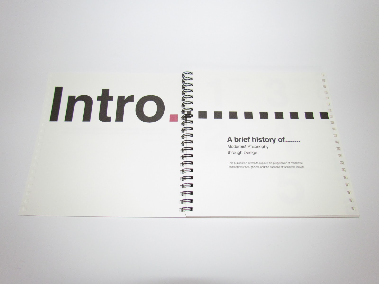
I have decided to bind my publication using the wire bound technique because it reflects the ideas of truth to materials and it will allow the publication to be opened flat which reflects the ideas of function.
I have chosen to print my publication on water paper stock because its a nice off white colour and thicker than paper which will be beneficial to the structure as Im wire binding it.
Thumbnails
To begin, I have mapped out some rough layouts to start to give me an understanding of how I'm going to structure my publication. I want to layout the contents in a functional way to guide the eye round the page by using hierarchy with type and image, experimenting with size and colour to draw specific focus.


The thumbnails with a dashed box around are the ones I will develop further when I come to constructing my publication. The ones I have chosen, I feel best reflect the context however, they are a rough guide at the moment and the body copy may inform the layout once its added.
Progress Crit- Presentation
The structure of my publication will be broken down into five sections:
- Modernism
- The Bauhaus
- Dieter Rams
- Braun
- Apple
To summarise, I want to communicate the progression of modernist philosophies and show the success of functional design and its ongoing presence within design. I will communicate this through the use of quotes, images and text used sparingly to reflect the ideas of function.
RESOLUTION CONSIDERATIONS
From the research I conducted, the most common format within modernist publications was a simple square. I have decided to use this format for my publication because I think its relevant to the content as modernism favours simple geometric forms.


Im using 'Neue Grafik' as a reference for my publication because I want to achieve a similar clinical, functional layout.
I have chosen the following dimensions for my publication:
Dimensions: 180x180mm
This will give me plenty of space to layout the content whilst still being able to utilise the negative space to achieve a clinical aesthetic.
Binding

I have decided to bind my publication using the wire bound technique because it reflects the ideas of truth to materials and it will allow the publication to be opened flat which reflects the ideas of function.
I have chosen to print my publication on water paper stock because its a nice off white colour and thicker than paper which will be beneficial to the structure as Im wire binding it.
Thumbnails
To begin, I have mapped out some rough layouts to start to give me an understanding of how I'm going to structure my publication. I want to layout the contents in a functional way to guide the eye round the page by using hierarchy with type and image, experimenting with size and colour to draw specific focus.


The thumbnails with a dashed box around are the ones I will develop further when I come to constructing my publication. The ones I have chosen, I feel best reflect the context however, they are a rough guide at the moment and the body copy may inform the layout once its added.
Progress Crit- Presentation
We had to create a presentation for the progress crit to show our concept, development and resolution.
The feedback I received was useful and has given me a clearer sense of direction to allow me to move forward with my presentation.
To achieve synthesis, it was suggested that I strip it down the bare essentials to reflect the idea 'less but better.' The amount of body copy was questioned and suggested that it didn't need a lot of copy. It was also suggested that I use colour to create hierarchy within the text, particularly heading and subheadings.
I agree with the suggestions made however, the modernism/historical section will need to have more copy to give context. I am going to use two colours, cyan and magenta, throughout the book to high light areas.
Development
I used an eight field grid for my document because I like proportions and the amount of possible solutions it allows. I used the same dimensions on the top, bottom and outside margins (10mm) and (15mm) on the inside margin to allow space for the binding.

I decided to just have the phrase 'less but better' on the front cover because I felt any more text would defeat the purpose of the idea.

I decided to put a quote by Dieter Rams on the first page for impact and to enhance the meaning of the quote.

I decided to put the subheading 'A Brief History of...' on this page instead of the front cover with a precise statement of what the book is about.

I didn't change the contents pages layout but I introduced the two colours that feature throughout the document in the dashed lines.


I kept these two pages the same layout as the thumbnails because they worked when the body copy was added. I had to experiment with tracking and point size to get the copy to fit properly. 9 point size worked the best with 11pt leading. I will use the same throughout for continuity and function. I like how the Utopia heading is on the right page because its reflects the idea of harmony and balance.

I had to rethink the layout for this page because I wanted the size of the headings to be the same throughout and it wouldn't fit on the page how I'd originally laid it out. This made me think that the headings should all be on the left page apart from the Utopia heading to make it stand out.

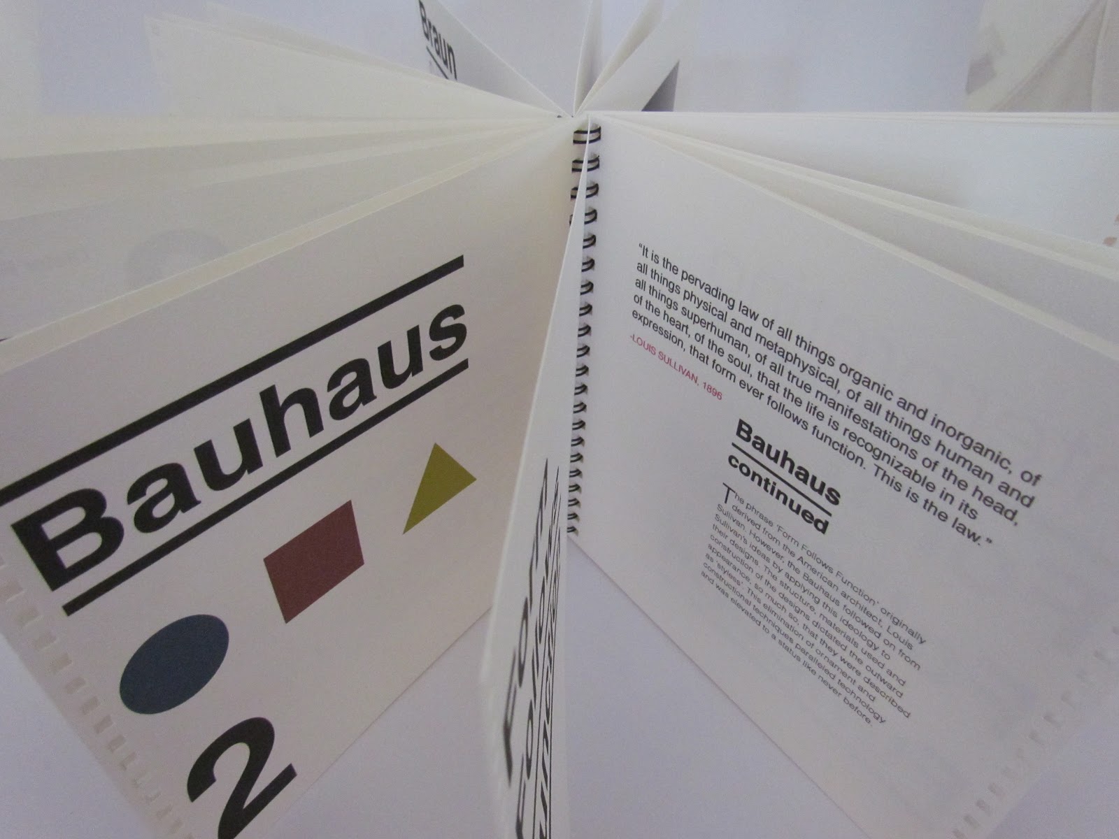
I was going to have an image of the Bauhaus but decided against it as I felt it wasn't necessary so I replaced it with a quote. I laid out the body copy to reflect the symbols positions on the left page to create a balanced layout.

As well as using colour, I used the thick block lines as a means of hierarchy. I laid out the copy on this page to lead the eye diagonally across the page because its a two part section.

Here I used magenta to highlight the word 'Interpreting.' I did this because the text on the following page in the same colour is the interpretation of 'form follows function.'


I decided to end the book with the same quote at the start, highlighting certain words to make a statement and to sum up the publications message.
Digital Book Version

I simplified this layout to one column of copy that is central. I decided to use cyan for the Ram's sections as he is the main point of focus.

This is the first page of the '10 principles of good design.' I tried the numbers on a large scale like the original thumbnail but I think it was too over powering. I made it the same size and the same positioning as the images so your eye looks at the number then the image then down to the text. The following pages of the '10 principles', will have the same layout.

I decided to position the image on the right page to coincide with the photo of Dieter on the previous page.

This layout hasn't changed much apart from I decided to leave some negative space towards to inner margin to let the eye take it in better.

Same as before, I kept the layout similar to the Dieter page as they are the main subjects, keeping it centred. However, I broke the copy into two columns because the left column is about Apple and the right Jonathan Ive. I think this works well alongside the image to create balance.

I decided to rearrange the images to work alongside the heading. It opened up space for the copy which fits nicely alongside the straight line of the heading.

I decided to end the book with the same quote at the start, highlighting certain words to make a statement and to sum up the publications message.
Digital Book Version
Physical Book


Once I had got my publication printed I took it to a shop to get it professionally bound. The guy that bound it put the pages in the wrong order so some of the pages had the holes punched on the wrong side. I had to make a decision to get the rest of the pages hole punched on the right hand side and left the front and back cover to try and incorporate it into the design. As a result, the lettering on the contents page got punched but apart from that I don't think it looks too bad.
No comments:
Post a Comment