Wednesday, 8 January 2014

OUGD503- Jacked Lincoln Branding Research

The company is starting up an event in Lincoln for a new house music night so I wanted to have a look at some existing house music brands.


Lovedough and District are two of the most popular nights in Lincoln at the minuet so I thought it would be a good idea to have a look at how they brand them selves. They both use geometric shapes to compose the letterforms, this is something I was thinking of trying for my solution. I think it works well with the style of music played.


Moda Black is the most successful house music label to come from lincoln. It uses circles to form the shapes of the letterforms. 


Record Labels 

I wanted to have a look at record label logos that are associated with a similar style of music. 


Black and white seems to be the most popular colour used with the logos. I think this is a good base colour then variations can be used depending on the context.


A lot of the logos I have looked at use bold blocks of black which I think works well for maximum impact.


I like how these logos have a border, it would work well to help it stand out on different backgrounds.


I like the letterforms used in these designs, Im thinking I will make my custom letterforms from shapes instead of using existing ones to create a unique logo for the brand.


Album Artwork


Both these designs have a minimal aesthetic with high contrasting colours to help make them stand out. I think simplicity will be the best approach for this design as it needs to be instantly recognisable.


I like the colours used in these designs and the use of shapes in the design above to make the logo. 


Inspiration 

The event will be in a small venue so I had a look at some inspirational images to get a feel for the environment which will inform the design.


Social Media


I will need to design a cover photo and profile picture for Facebook so I had a look at the page dimensions.

Profile Picture:
180px
180px

Cover Photo:
width- 851px
height- 315px

Monday, 6 January 2014

OUGD504- Restaurant Name Research


I was trying to think of names for my restaurant that related to type in some way. Whilst researching Japanese gods I came across one that was the God of language, learning and calligraphy that was supposed to of taught humans to write. 

I thought the Name Tenjin Yakitori bar would be the best fitting name for the brief as it has a link to typography and yakitori is the style of food being served. I decided to label it as a bar because the food is for sharing for a sociable event so I felt a bar would be the best settings for this kind of outing.


Speaking of what they look like, what makes a Japanese dragon a Japanese dragon? When most westerners picture a dragon, they’ll think of the above mentioned European style dragons with their big wings and fire breath. Japanese dragons are quite different. Japanese dragons, and Asian dragons in general, are much more serpentine than their European counterparts. Japanese dragons also only have three claws on each foot, and don’t fly as often as they lack wings.


Japanese dragons have three claws so I though I could incorporate this into my design to add to the concept. I want to include a dragon in my design but the conventional style of illustration.

OUGD504- Paper Folding Techniques Research

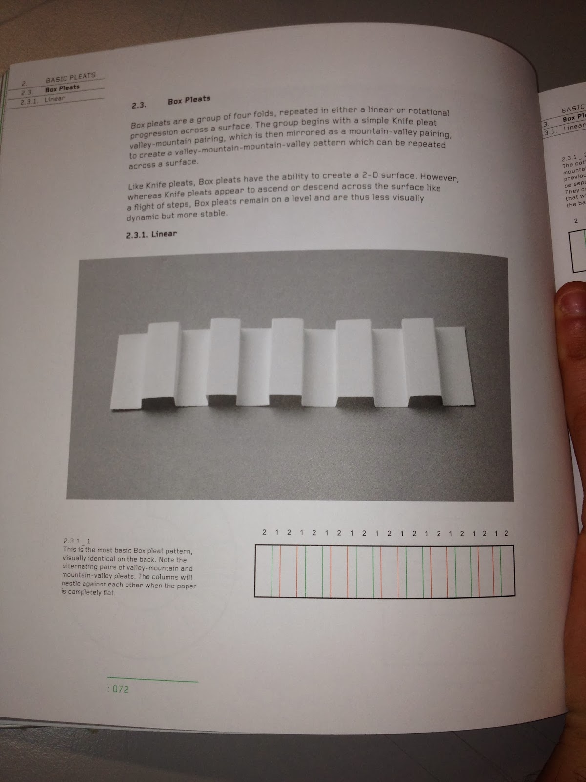
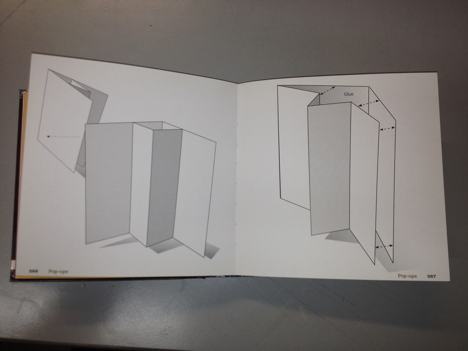
For the print side of the brief I am going to create a range of material so I wanted to have a look at different folding techniques to get some ideas.

Chopstick packaging was one of the things I wanted to include so I have found a simple design that I can use for a template.


This gave me the idea to create chopstick holders as I found its a common thing within Japanese restaurants. The designs below a simple but effect in communication a contemporary take on the idea.


Menu Design Ideas

The next thing I want to create is a menu so I have looked into different ways of achieving this in a bit more of an interesting way to the conventional flat menu. This will also suit the theme of the restaurant.


This design allows for the content to be displayed in different ways, the menu is broken down into four sections so this could be an option.


This design caught my eye because its interactive. When it opens it reveals the middle circle, this would look really impressive with the logo in the center.


I like the idea of using this for the menu because it represents the bars on the cooking grill which is the main idea behind the menu and style of restaurant. This could be for the sit down menu as it can become part of the table feature.


This design would work well with the style of food as it could be self standing on the tables.


I like how the design above and below are in three sections, the first could display the logo and restaurant name, the second could be the drinks etc and the third the main menu.


The design below is pretty simple but the fold at the top could be modified to create a nice decorative effect.


I really like these two design because the folds relate to the type of restaurant by representing the grill that the food is cooked on.


OUGD504- Traditional Japanese Print Research

The images are sourced from the book Japanese Popular prints. I wanted to have a look at the kind of colours that are traditionally used in Japanese print. This will give me some ideas when I come to choosing my colour scheme.


I want to keep it simple but with impact so the colours will be limited like above, maybe no more than three to keep consistency across media. 


Red and black feature a lot in Japanese prints so I am going to use these colours in my designs.


A Japanese dragon definitely has three claws on each foot (Chinese dragon has five, Korean has four).

Ascending dragons are associated with success in life in Japan so I think it would be good to incorporate this somehow, also the three claws could be represented in my design.